Analysis of Brand
ROSSMANN uses for its word brand a serif font, although the visual brand is in a clean and totally round circle and represents a sans serif "O". In my Opinion, they should use a completely sans serif Font as well. To be hones: Before I started my research about ROSSMANN, I didn't even recognize, that the figure in the circle is meant to be a centaur. I was actually always wondering, what it's supposed to be.
As I started to analyze the centaur logo in detail, I recognized a few things, which don't make sense to me: It can't decide, whether it should use round or edgy edges, the diagonal lines in the logo go into different directions and it seems like it is set together from randomly formed geometric shapes.
Rebranding of the visual Brand
I started by separating the original logo into its original geometric shapes. For the redesign I took a realistic picture of a centaur as inspiration. Step by step I transformed the edgy forms of the old logo into dynamic ones and created a new visual.
Old vs. new
For the word brand, I chose a sans serif and very round font, so the visual brand fits in without sticking out too much.
Here you can see the comparison. What do you think?
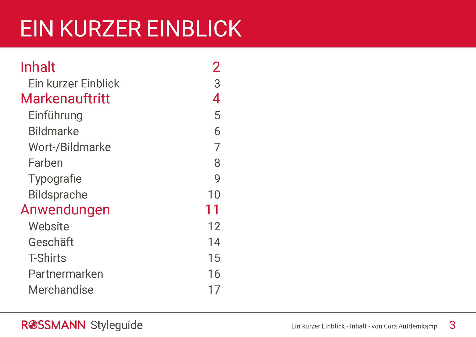
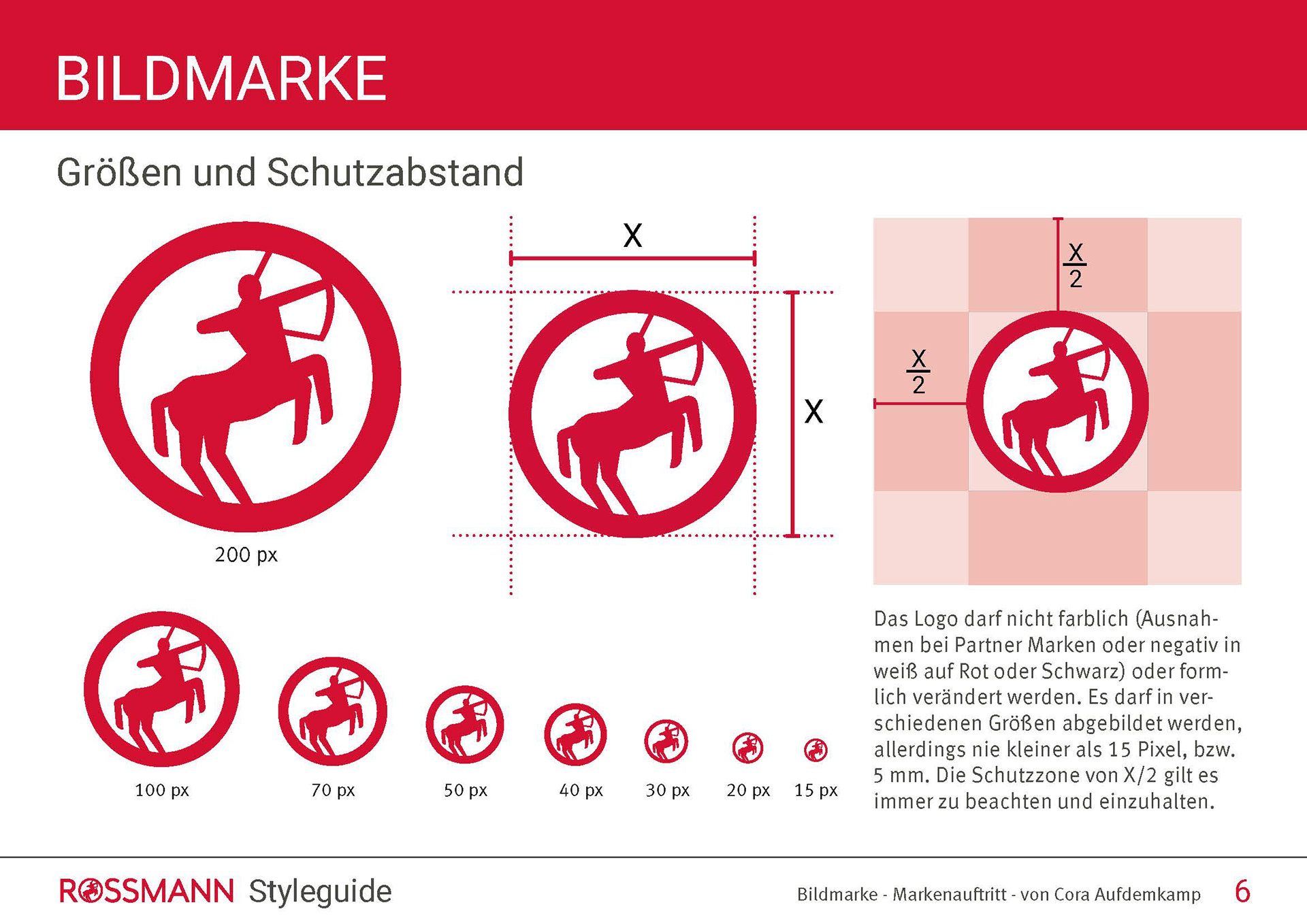
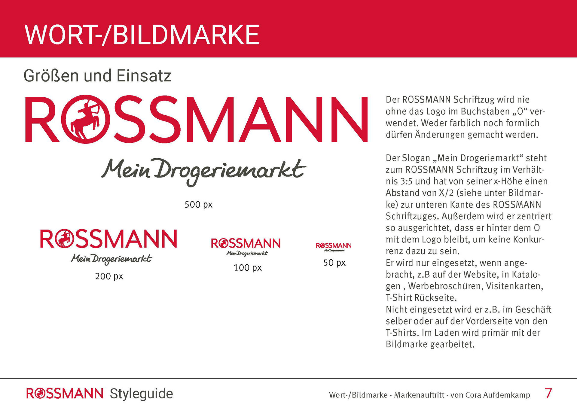
Style-guide
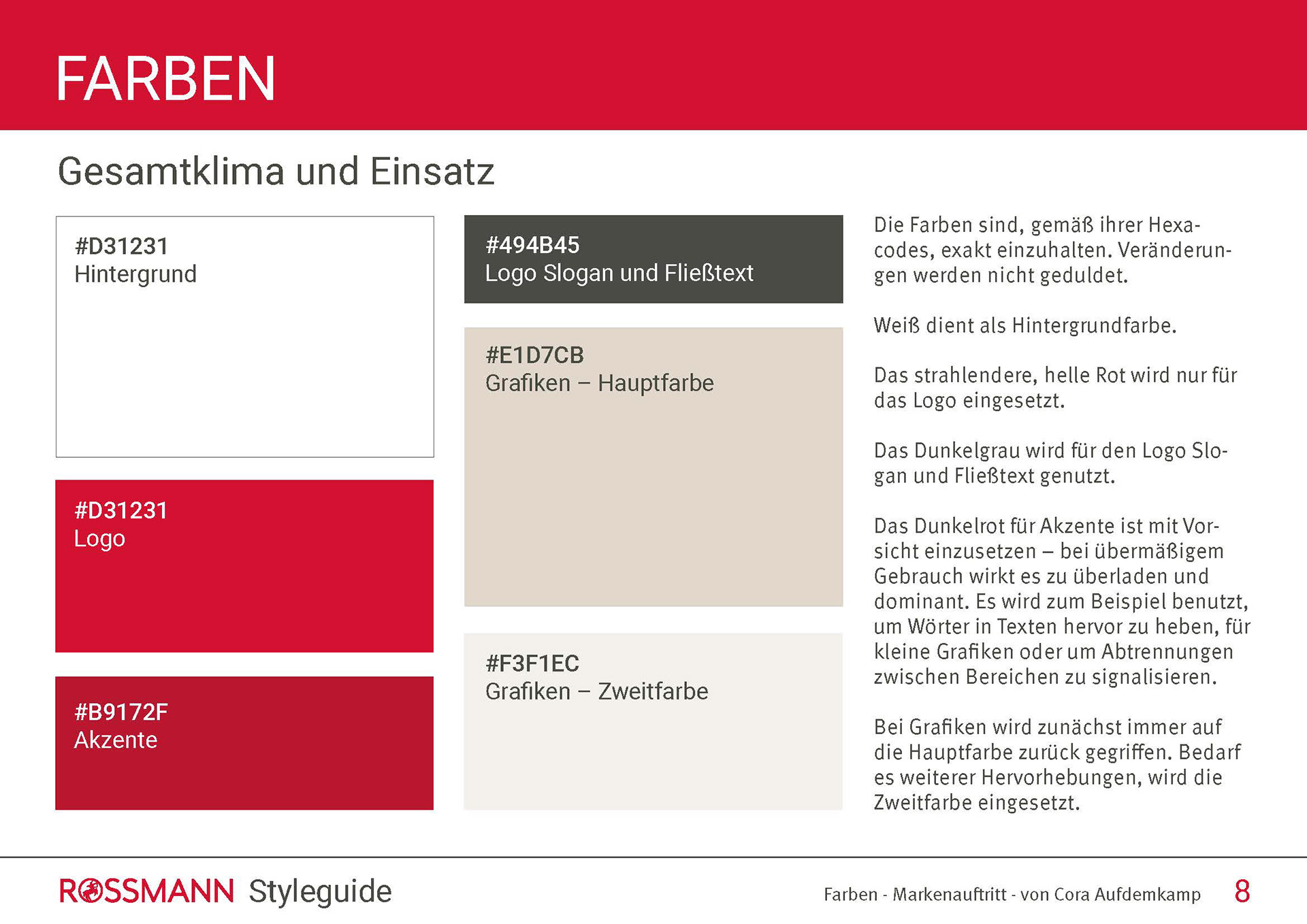
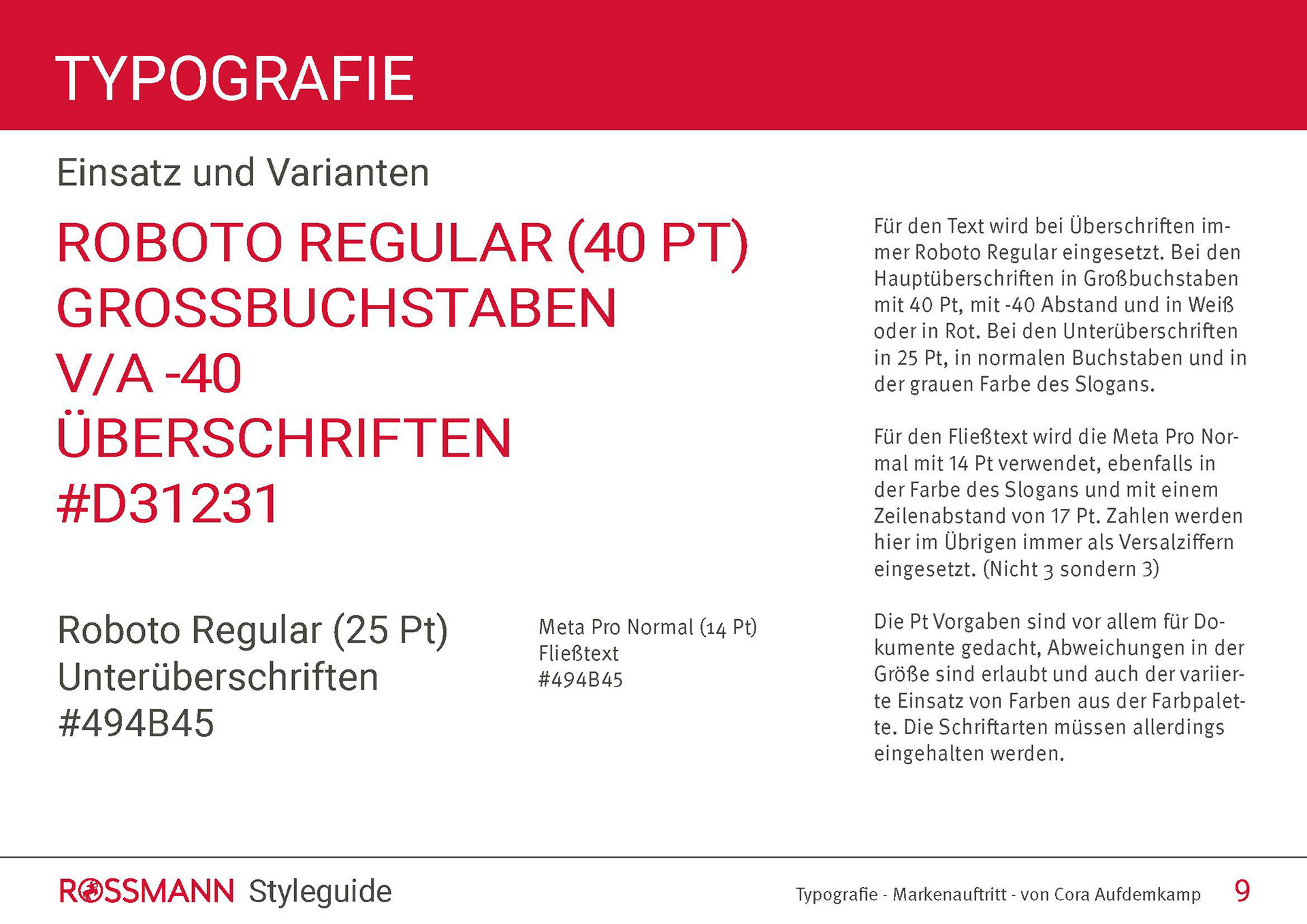
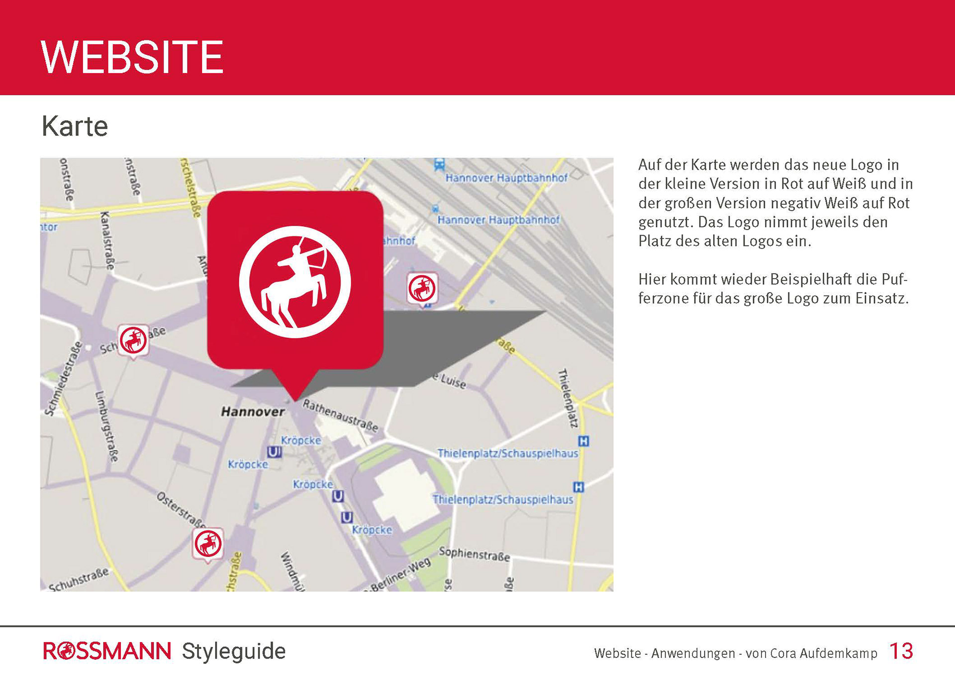
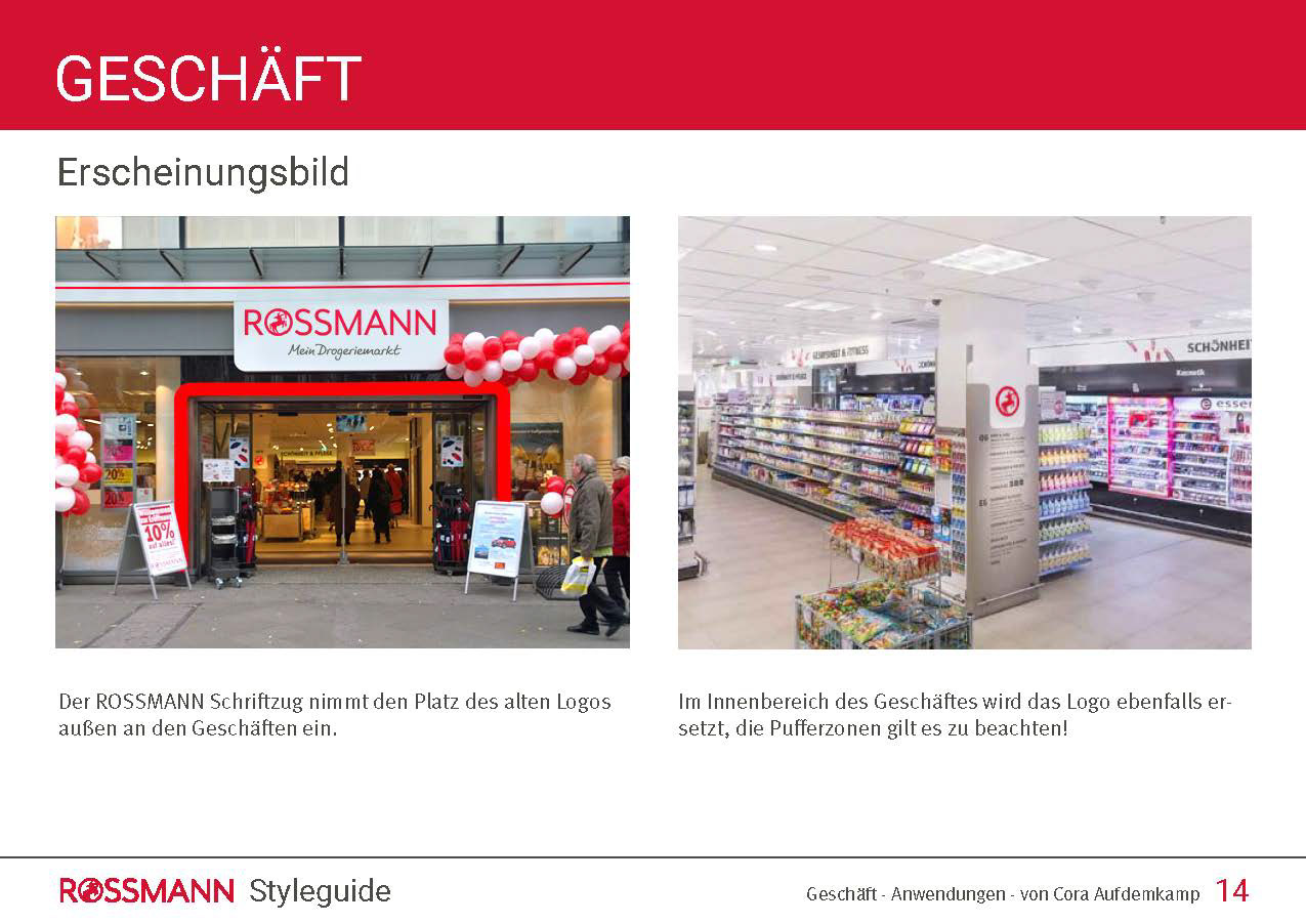
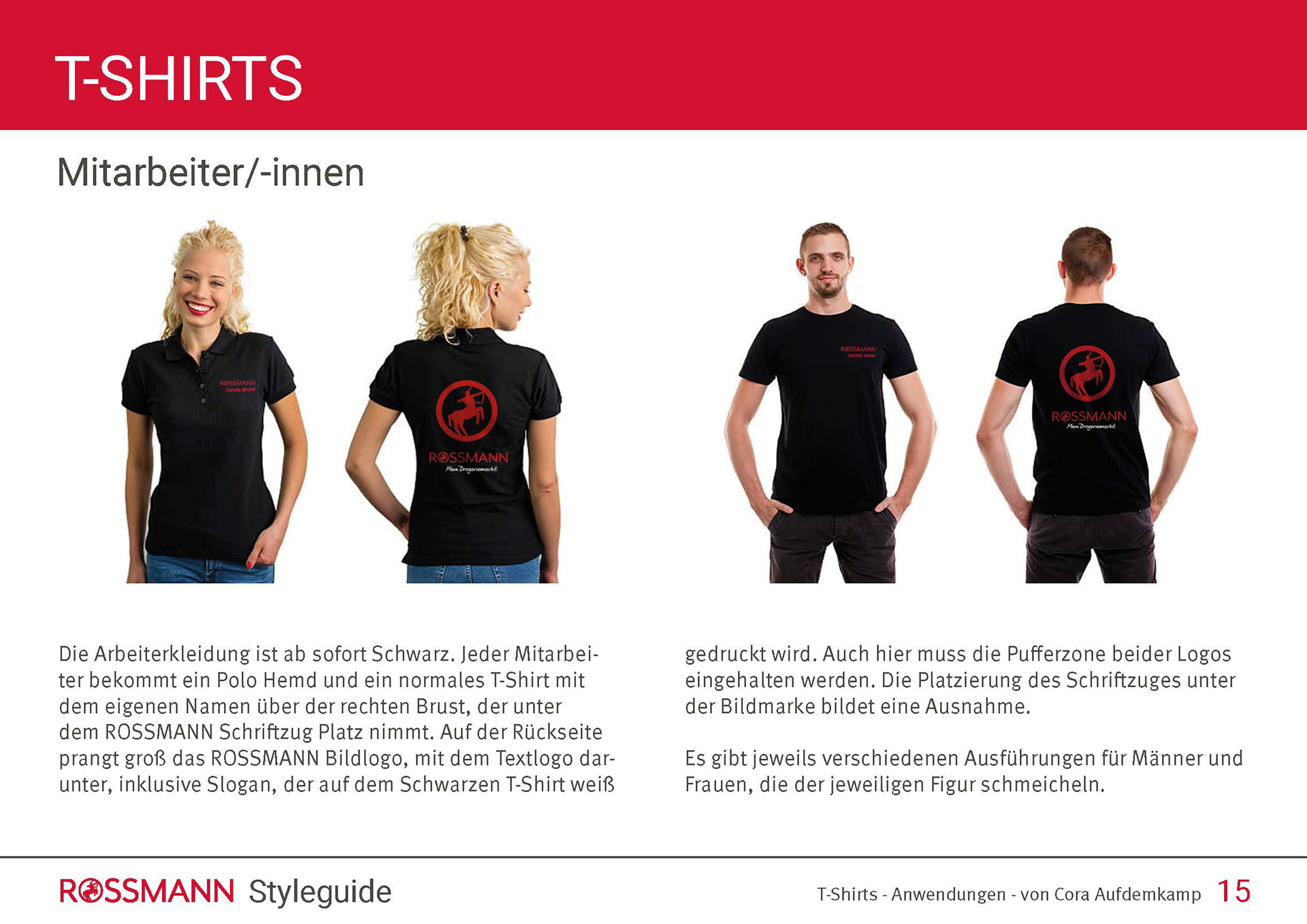
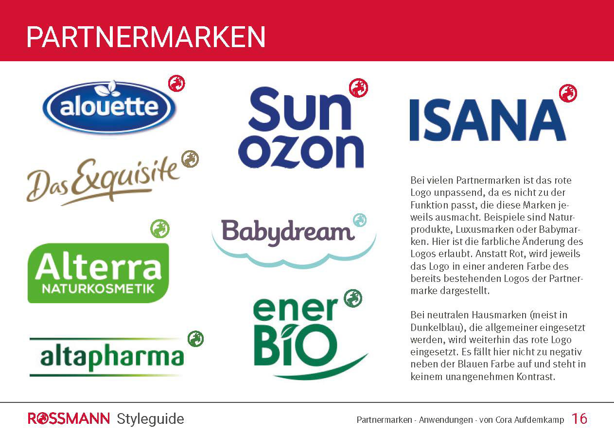
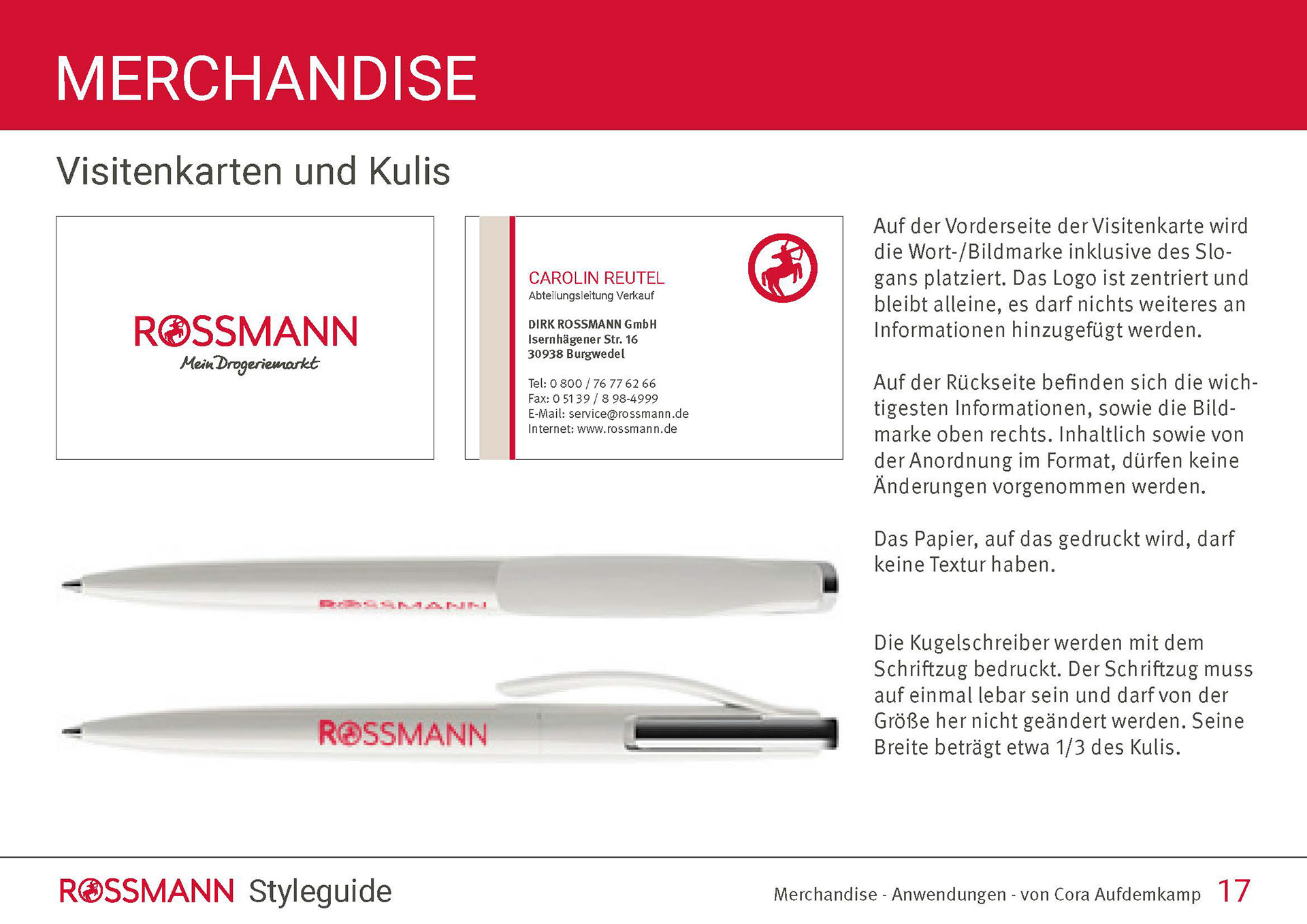
The style-guide is only available in German.
Normally, these are slides from a PDF file. For the ultimate style-guide-experience, klick on the first picture and swipe to the right all the way through the pages.
